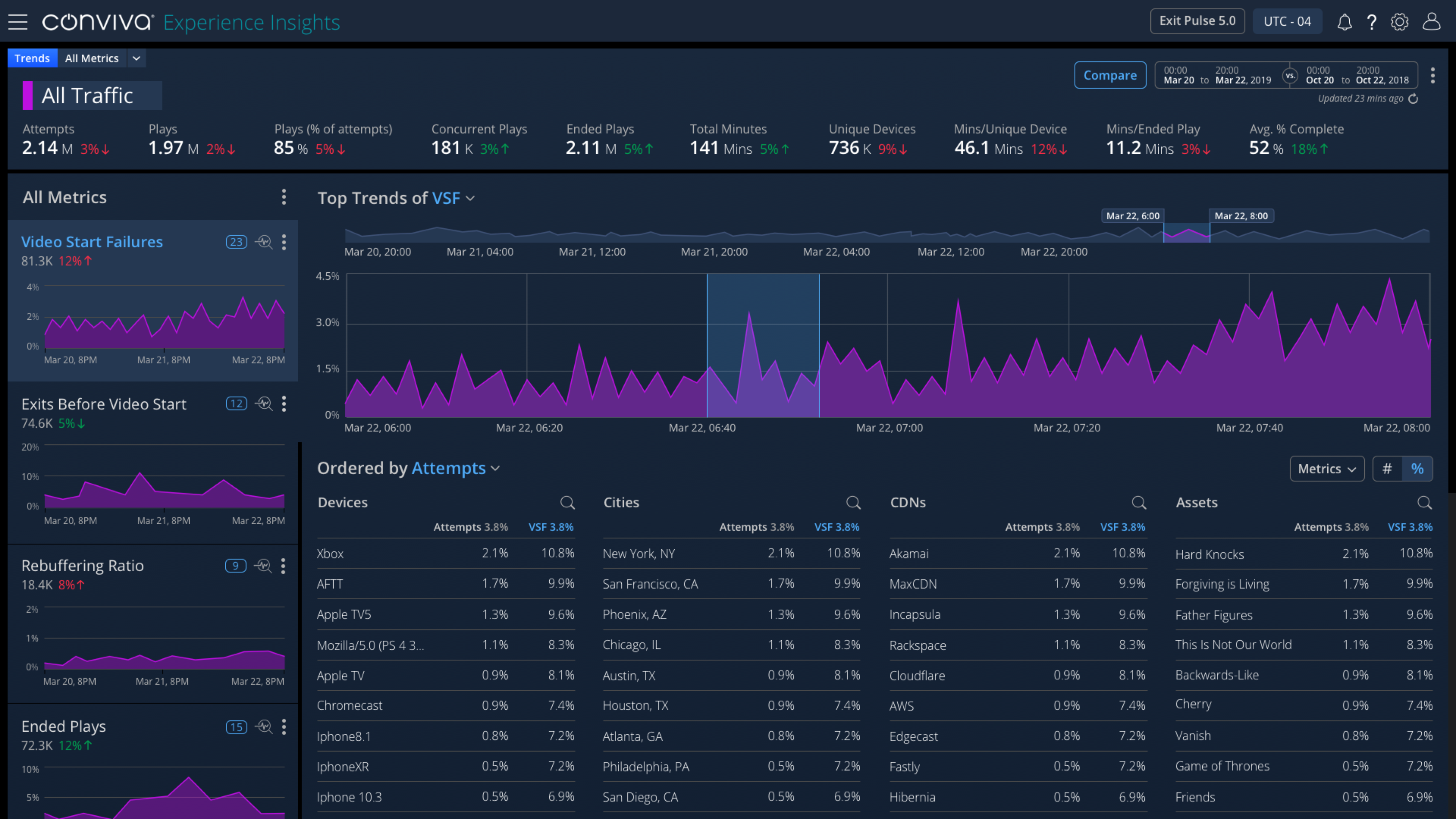
The Experience Insights product allows a CSR or Tech Ops User (streaming media publisher org) to review all facets of their customer's streaming experience. After being informed by the CSR of a customer's streaming complaint, the Tech Ops person has to determine the issue type (play start failure, streaming error, low quality video, etc.) and then they have to define the impact (cohort vs. single customer). In the current system there was no way to further investigate the streaming issue and the impact; is it related to a cohort, a particular show, device, location or to a single user? My solution allowed users to drill down into a single customer's Viewer Timeline from the cohort level.

As the Principal Product Designer in a very small team I was responsible for building the end-to-end design solution for this new feature called Viewer Timeline for Experience Insights product @ Conviva. This included the following aspects:
Research - I had to thoroughly understand my primary user base; the Tech Ops role, their workflows, goals and challenges. Through interviews with multiple Tech Operations personnel across our user base, I created a Tech Ops persona. I sat close by the sales team (small team office environment) so it was easy to reach out to them directly about finding the target users within their customer orgs. They were all very eager to help build a better product experience for our users.

Sprint Planning - Then I looked at the ambitious product roadmap with 2-3 week sprints. If we do parallel design and development, we do not have time to build out great user experiences. That was my main challenge to management. Help us push out these dates and give us an opportunity to share concepts, gather feedback from end users. We also needed to be an iteration ahead of Engineering. We heard back (and this happens often in the Enterprise world) that our Product teams and management understand the users well so its not needed. In order to reach a compromise, we introduced the Lean UX model to accommodate our schedule and to allow for research time.

User Flows - I came up with a couple of different options for the proposed solution. Both flows allowed Lisa, our Tech Ops user, to deep dive into the streaming data at a cohort level aka Trends View page. Then she could select the issue type (Exits Before Video Start, Video Start Failure, etc.) and apply filters to narrow down the cohort view to shows, devices, locations.

Mockups - From the 2 separate flows, I created 2 sets of lo-fidelity mockups + Invision prototypes in order to get an initial round of feedback, mostly internal (product, engineering, mgmt). Achieving cross-functional alignment early on in the process is essential.
Technical Constraint - One of the challenges I had was trying to figure out the design for the lower half of the page. Engineering said the calculating and displaying of the initial data set would be impossible. The compromise was to display the Viewer Sessions results list for up to 2000 sessions. Therefore I defined a model where the section would be there with a message that asked the user to narrow down the list further using the visualizations above until the results displayed.

User Study 1 - Then I collaborated with Sales to get some face time with our end users for quantitative A/B testing. Much to my chagrin, majority of our users had no problem with option 1, the lengthier view because they typically work on larger monitors (some vertically placed in NOCs) and are used to looking at large screens filled with data. They also preferred to do numerous investigations on the page to narrow down their list of Viewer Sessions before proceeding to look at the details on the next page.
User Study 2 - After User Study 1 concluded, I received buy-in from Product on the changes and put together a formidable Option 3. This was presented in an Invision prototype with hi-fidelity screens representing one of the key user scenarios. This was accompanied by plans for User Study 2, task-based analysis and questions for the user study. Did the navigation make sense? Are the tasks/data sets realistic for the particular scenario? Are the buttons discoverable? Does the terminology align with those used within their org? Would this feature help them? Any challenges? Any use cases we overlooked or got incorrect?
This set of screens is from a Rebuffering scenario where the Tech Ops user is able to select the issue type (Rebuffering), then use the top-level visualization (timeline + distribution graphs) to narrow down the data set to a list of Customer Viewer Sessions experiencing that error.

A Forgotten Use Case - One of the key discoveries we made during the user study was a number of organizations would love to utilize the Viewer Timeline for error handling resolution. That was a use case that was overlooked entirely. So in the following iterations and customer follow-up sessions, I modified my prototype to address that use case to tie in the workflow into another area of the Experience Insights app which allows users to resolve errors from a list. They loved it!
The Viewer Timeline - From the list of Viewer Sessions, Lisa can click on any of the Viewer IDs (column 1) to bring up the Viewer Timeline. This screen shows the complete detail of the viewer's streaming experience and when OR where the errors occurred along with their environments (location, devices, casting mode, internet connectivity, etc.). Instead of having to weed through large lists of raw data, our Tech Ops users welcomed this ability to go from notification-to-error definition in a simplified workflow.
With the introduction of the Viewer Session page in context, they could now:

Implementation - Once the designs were finalized, I shared them with Engineering (UI Devs) via Invision (Inspect). They also received a demo and we regularly checked progress in JIRA and communicated via Slack/Zoom. I would also do some of the design QA and post UI bugs to JIRA.
Additionally we were building out a component library. So another aspect of my deliverable was to work with another designer to get some of these designs transferred into the components work she was doing. As I mentioned the Tech Ops users typically worked in NOCs and would monitor large displays of data in dark mode (mounted tvs) and work in their desktops in regular mode. So I had to create dark modes of these designs + "componentize" the visualizations.
